HAUTE DÉCO - 2006 to date
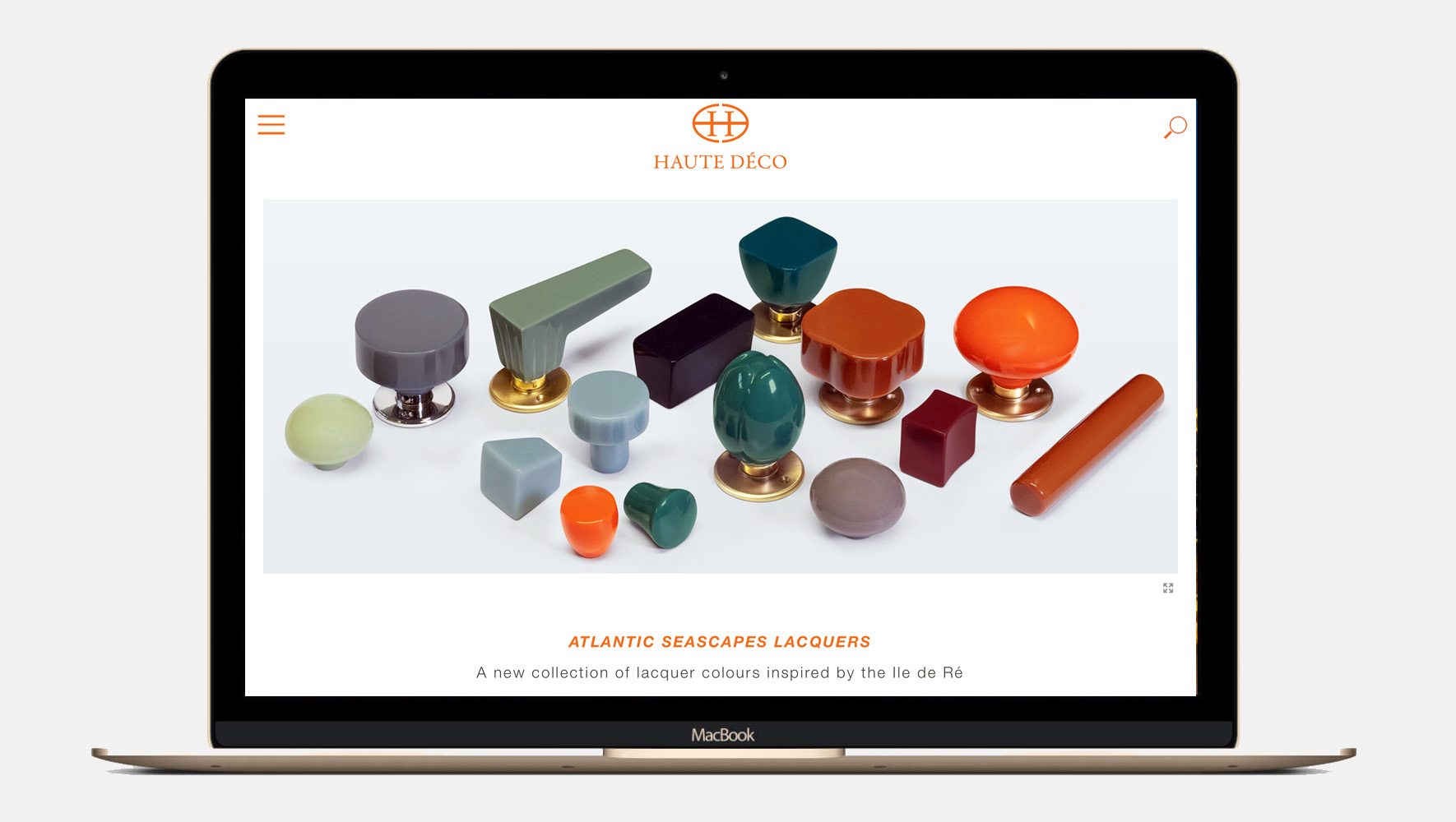
The 2022 brief
for HAUTE DÉCO's online presence was to produce a new layout whereby the majority of the individual collections are featured on the homepage
What we did
We introduced the flex-base layout already implemented on Landing and Company pages, to display the majority of collections so site visitor would have immediate access to the collection of their choice.
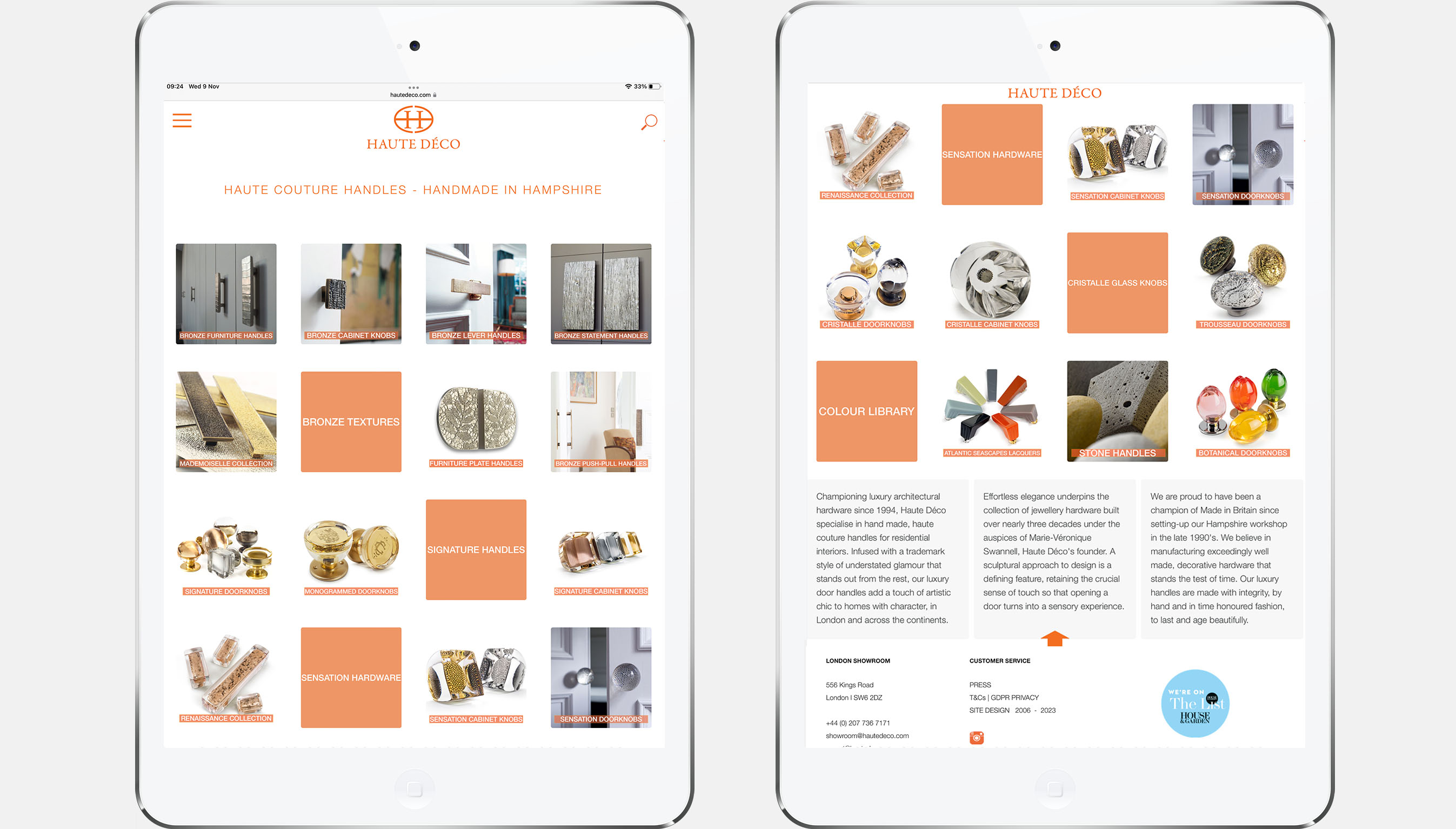
2022 home page
The 2018 brief
for HAUTE DÉCO's online presence was to improve + simplify the user experience
• Rework Navigation Structure
• Restructure Landing + Company pages
• The new site works across devices
What we did
Introduce a flex-base layout on Landing and Company pages that works across all devices
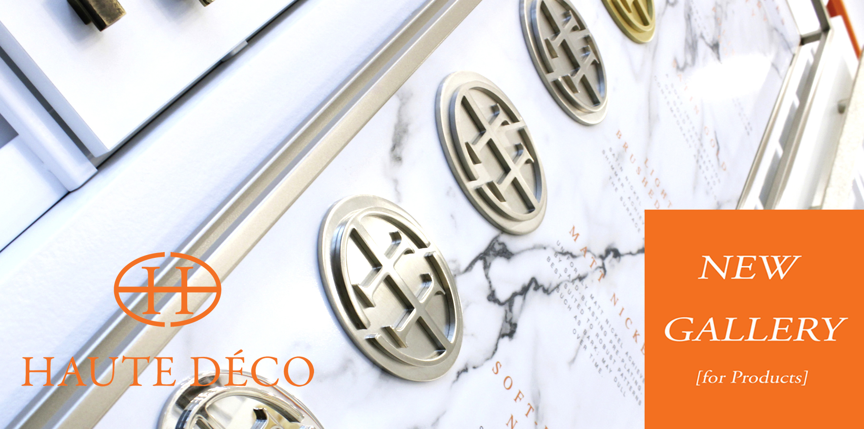
Develop new 'Gallery' layout to accomodate product features drawn in from the existing product database by category
Custom-build product detail window and enquiry form
Create a 'Colour Library' section to illustrate the width + breath of individual collections
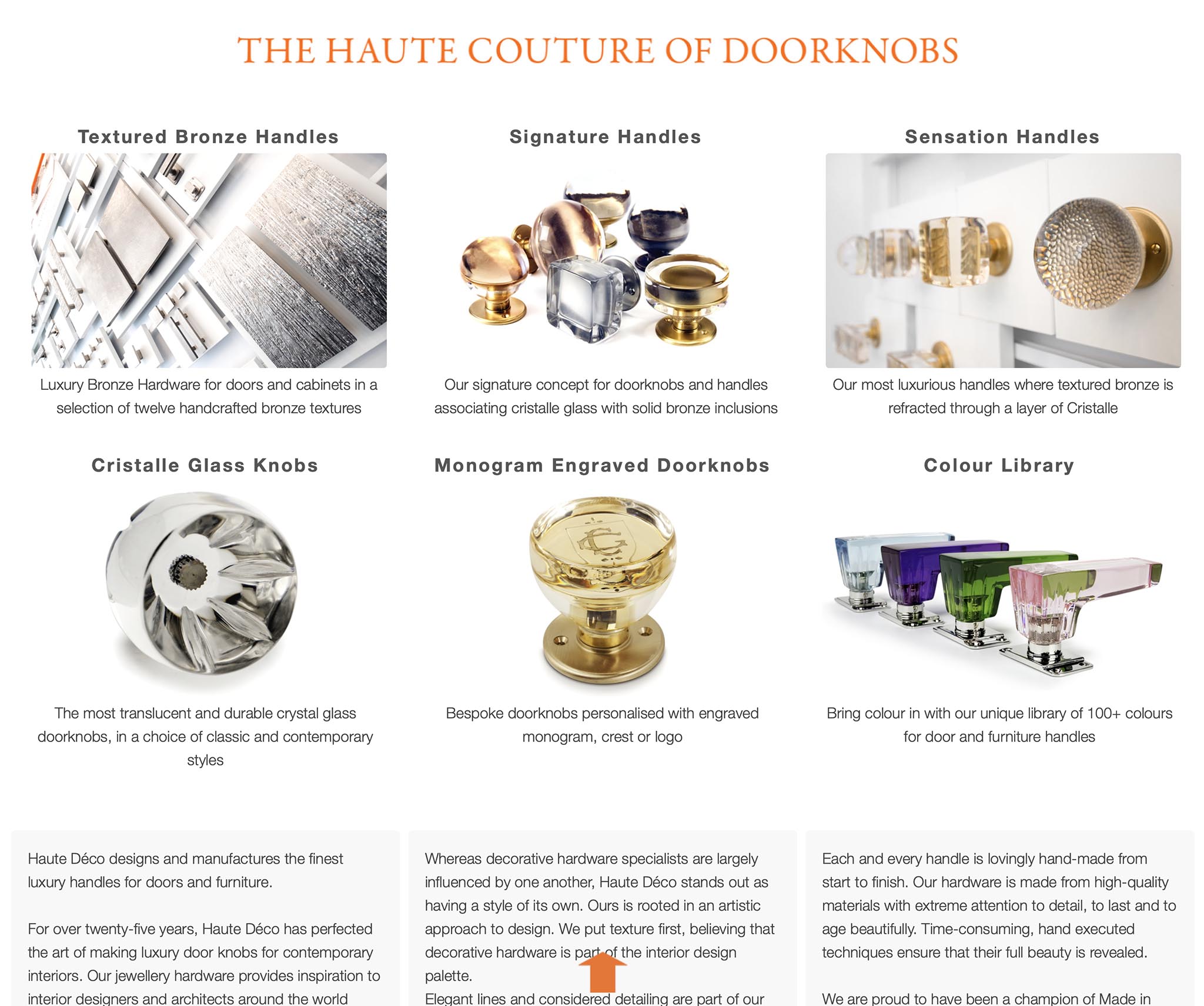
2019 home page
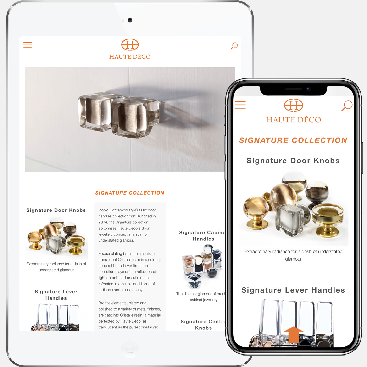
SIGNATURE landing page
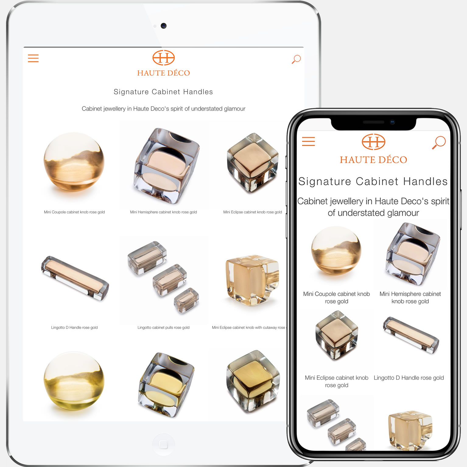
SIGNATURE cabinet knobs
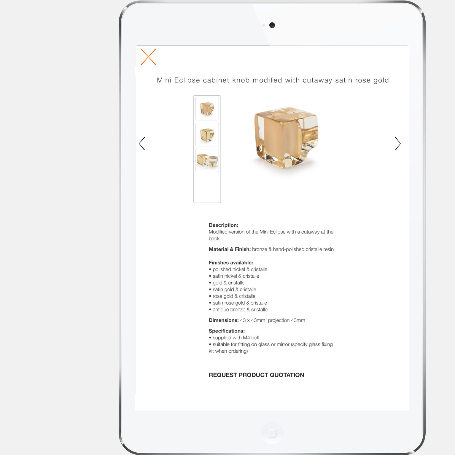
product details + extra finishes
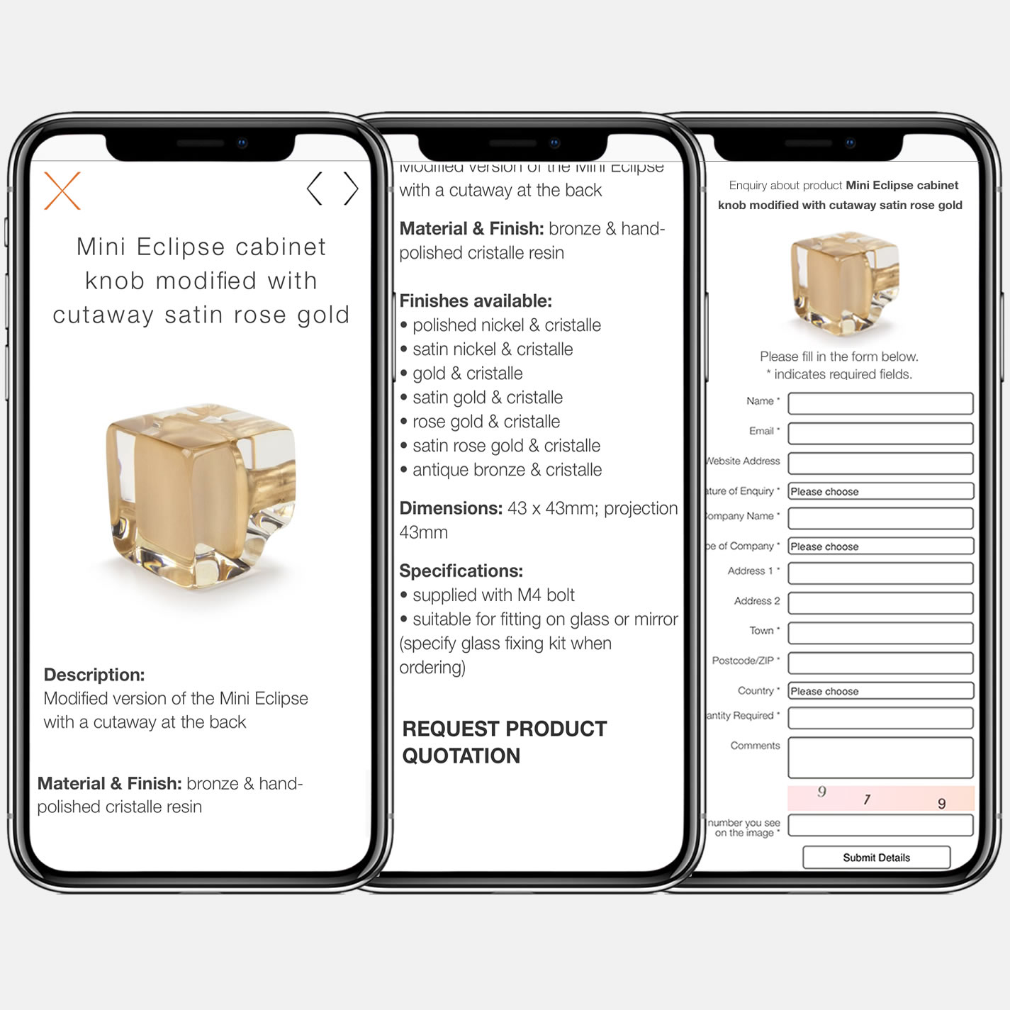
product detail window + enquiry form on iPhone
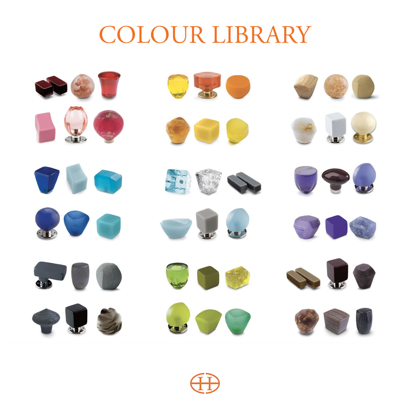
'Colour Library' of over 100 colours ranging from soft neutrals to vivid hues..
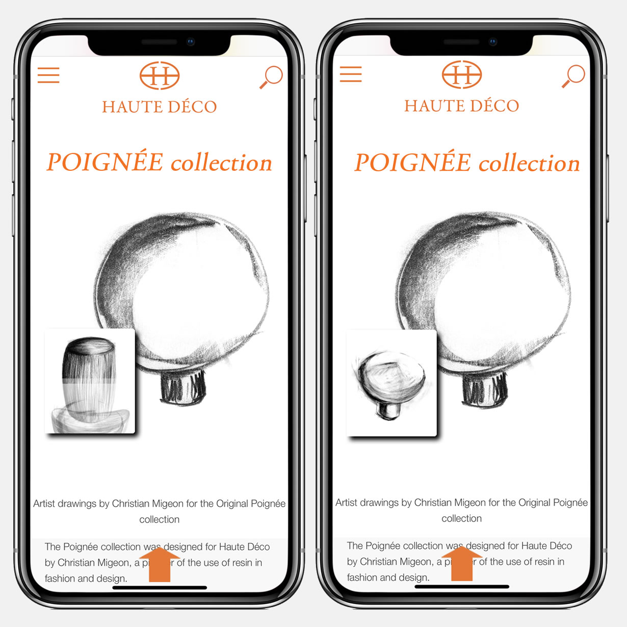
Poignee collection uses animated run of drawings
The 2016 brief
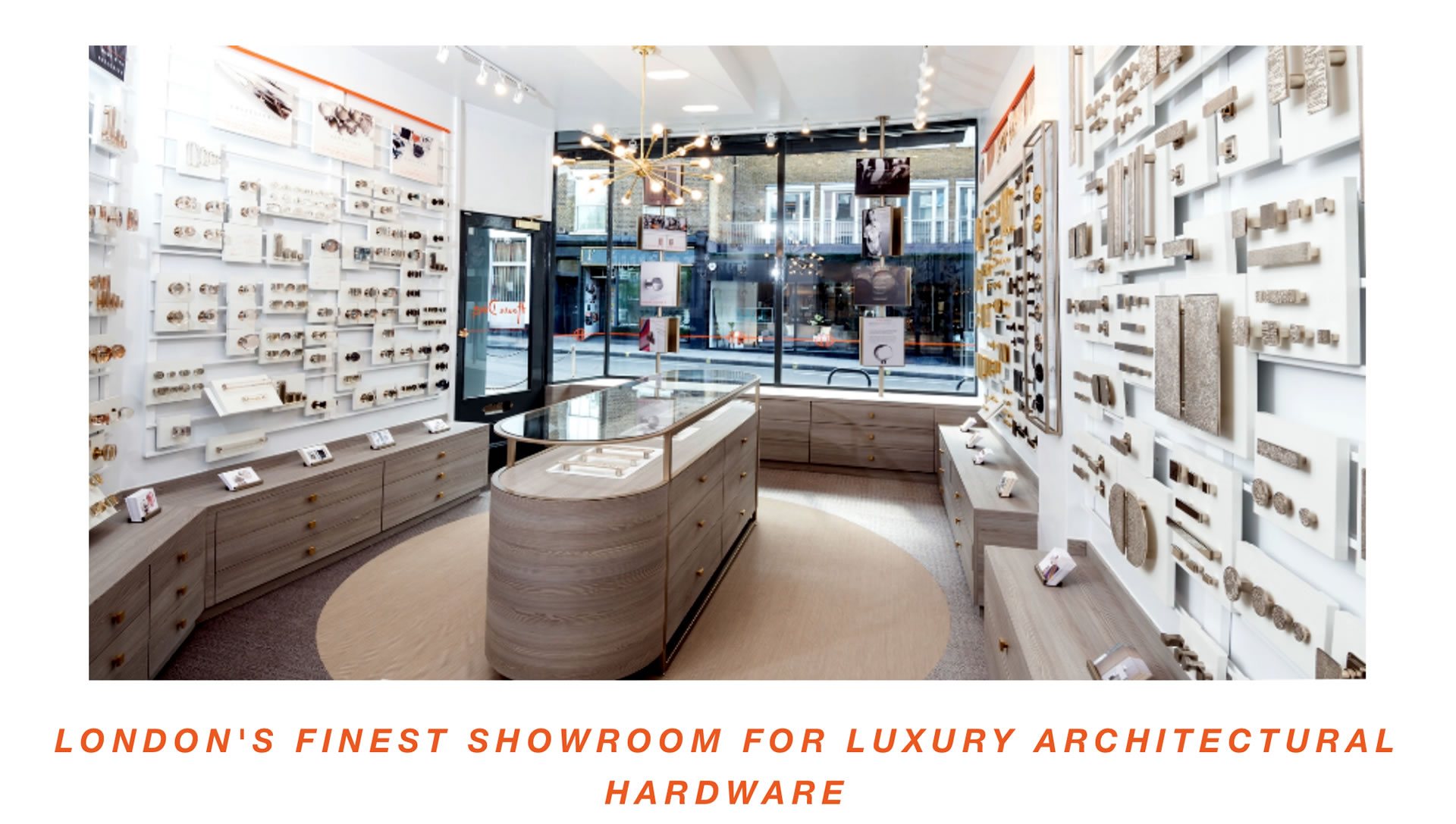
for HAUTE DÉCO's online presence was to reflect its retail outlet branding in every aspect
Since 2006 - HAUTE DÉCO’s launch of the first eCommerce website - to date, the website has seen various modifications in colour, layout, and lately to match the new branding of its retail showroom in London's Kings Road.
What we did
Haute Déco’s reworked site featured an exciting new layout and colour scheme to mirror the new graphic brand direction and retail interior concept.
The new look was based around a re-structure of product presentation encapsulating the mood and feel of the brand through use of modern graphics and bold photography.
